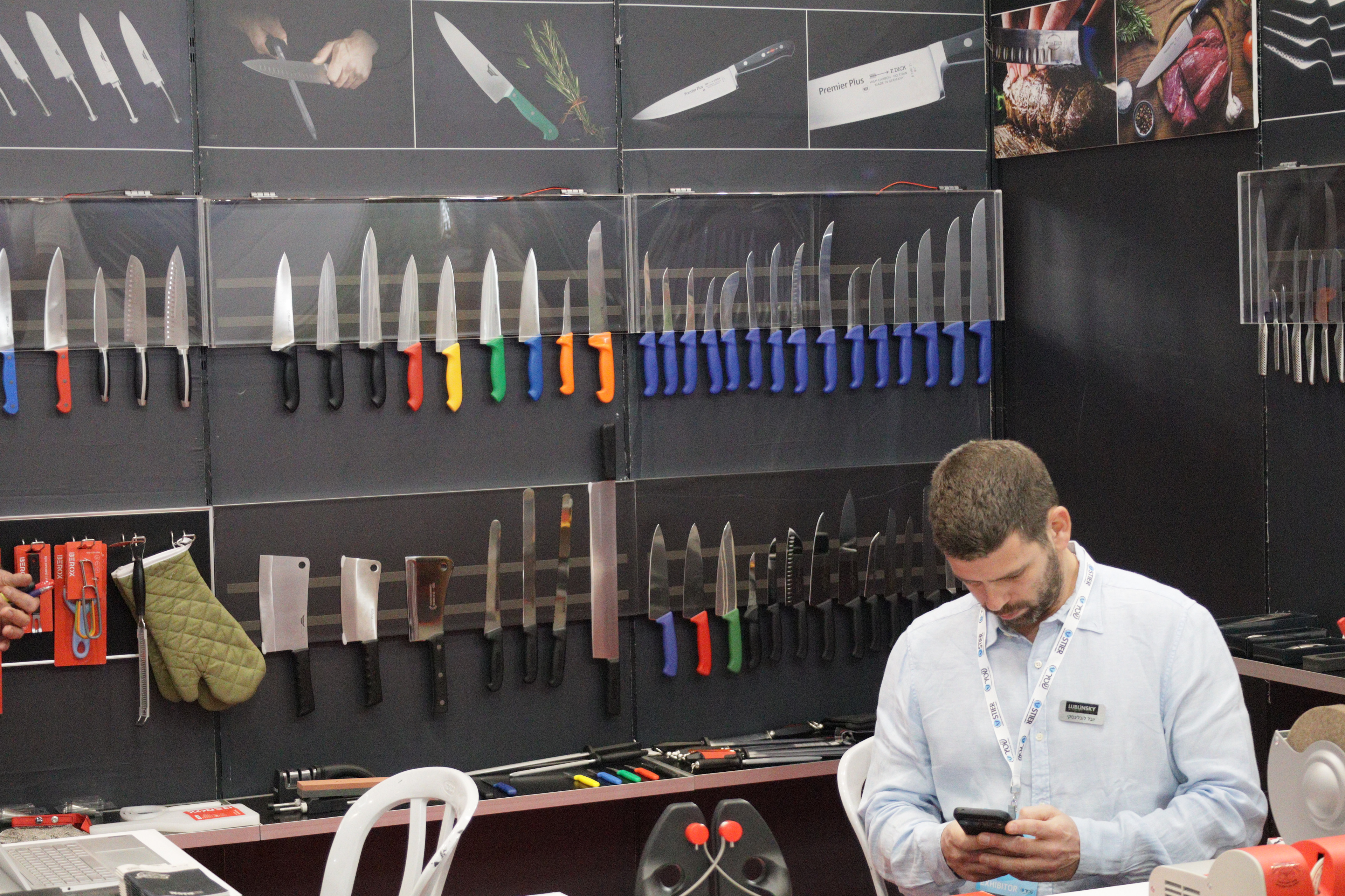
There’s something a bit amusing about how perfectly fitting a name can be. Standing in front of this wall of knives — rows upon rows of blades aligned like a military review, handles in colors that feel almost playful against the cold precision of steel — the name SharpKnife.org suddenly feels inevitable. The scene is a mix of craftsmanship and quiet intensity: polished chef knives with tapered edges, serrated bread cutters, heavy meat cleavers, and that unmistakable glossy blue-handled lineup that stretches almost endlessly. Even the guy at the booth — absorbed in his phone, badge hanging loosely — feels like part of the modern marketplace rhythm: tools, trade, and tech all mashed together.
The image speaks to what a knife marketplace should be. Not chaotic. Not gimmicky. Just clear, sharp purpose. The visual language is already here: the imagery of slicing herbs with clean precision, perfectly marbled meat resting under a blade, product shots showing geometry, balance, mastery. A name like SharpKnife.org channels that same clarity. It instantly signals relevance, authority, and intent — not in a hype way, but in a direct, credible, almost utilitarian manner. It sounds like a place where both professionals and enthusiasts go not just to buy, but to learn, compare, and choose. It has the feeling of a reference hub — a domain with backbone.
And the “.org” changes the tone in an interesting way. It makes it feel less like a store’s slogan and more like a category leader, the kind of website that hosts reviews, brand overviews, care guides, sharpening tutorials, and then — quietly and confidently — sells you exactly the right blade. It suggests community, authority, and neutrality, even if commerce is a core part of the model. In a world where knives can be anything from outdoor survival gear to precision Japanese craftsmanship to industrial food-processing tools, a marketplace needs trust and structure. SharpKnife.org carries that sense of order.
If someone were scrolling past domain names, some would be clever, some forgettable, but this one has that immediate click. It says exactly what it is. Short, strong, memorable. Easy to brand visually with blades, bevels, angles. The kind of name that, once seen next to a display like this, becomes almost self-explanatory. It’s direct, practical, and there’s a kind of satisfying sharpness to it — metaphor intended.
Feels like a keeper. A domain that can cut through the noise — no pun intended, though it sort of fits.